June 26, 2026
Author Ad Creative: Stealing “Beauty Ads Concepts” For Fiction (Cross-Training)
I’m getting ad style ideas I’d never think of even if I was forced to sit alone for eleven years on the moon and could only come back if I came up with these. I’m getting ad style ideas I’d never think of even if I was forced to sit alone for eleven years on the moon and could only come back if I came up with these.
And this is why I believe in doing cross-training, which involves taking concepts from other industries and niches and helping you adapt them for your own work.
The things people do in different industries are usually very different from what we do in the book world. This strategy allows you to find formats that your audience already responds to in other contexts.
The Research Loop: Following the Reader
I started this process by looking at a book in the Witch Romance and Paranormal genre. My goal was to figure out other products that the people reading these books are also seeing. I know if they are reviewing specific products, a percentage of them are seeing those things through Facebook ads. Whatever ads they are seeing have formats I could adapt for fiction.
I clicked on individual readers and noticed some patterns. Many of these readers only review books. I have done this in other genres, like Action Thriller, and found they might only review one book in that genre. Not every reader is a power reader. However, I found one buyer who reviews books, products, and purses. This person gave a five star review to a mascara from L'Oreal.
I took that lead to the Facebook Ads Library, filtered for the United States, and searched for mascara. I filtered out videos because I wanted to only see images and memes that stand out. Several concepts stood out to me, and I took those into Canva to see how I could adapt them.
Concept 1: The High-Contrast Minimalist
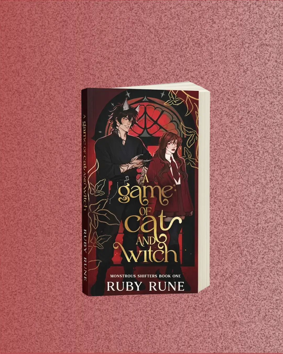
The first concept involves placing the product in the middle of a plain, white background. This is a common tactic to make an item stand out in the feed.
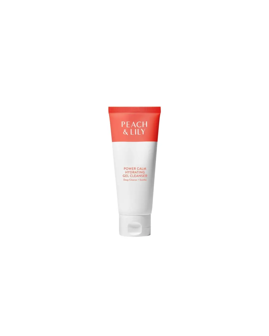 I like this concept for books, especially in genres where competitors have a lot of clutter in the design or in ads where you use a hooky excerpt from the book . You take the cover and make it a small part of the image size to draw the eye.
 If you're as carefree as I am, you can try this 👇🏿 type of ridiculousness too:
 Point of this exercise is to take a concept from industry ABC and tweak it as many ways as possible, without placing limits on how far you flip things.
The book cover does the heavy lifting here. You keep the background plain instead of having the cover fill the whole image. If you use a Kindle mockup, a phone mockup, or a paperback mockup, you introduce variety. Because the image is so simple, the first line of the primary text needs to do the heavy lifting. This is why I talk about doing spreadsheet work. You check your reviews and find the emotions and tropes that readers gravitate toward, and you put those in the first line.
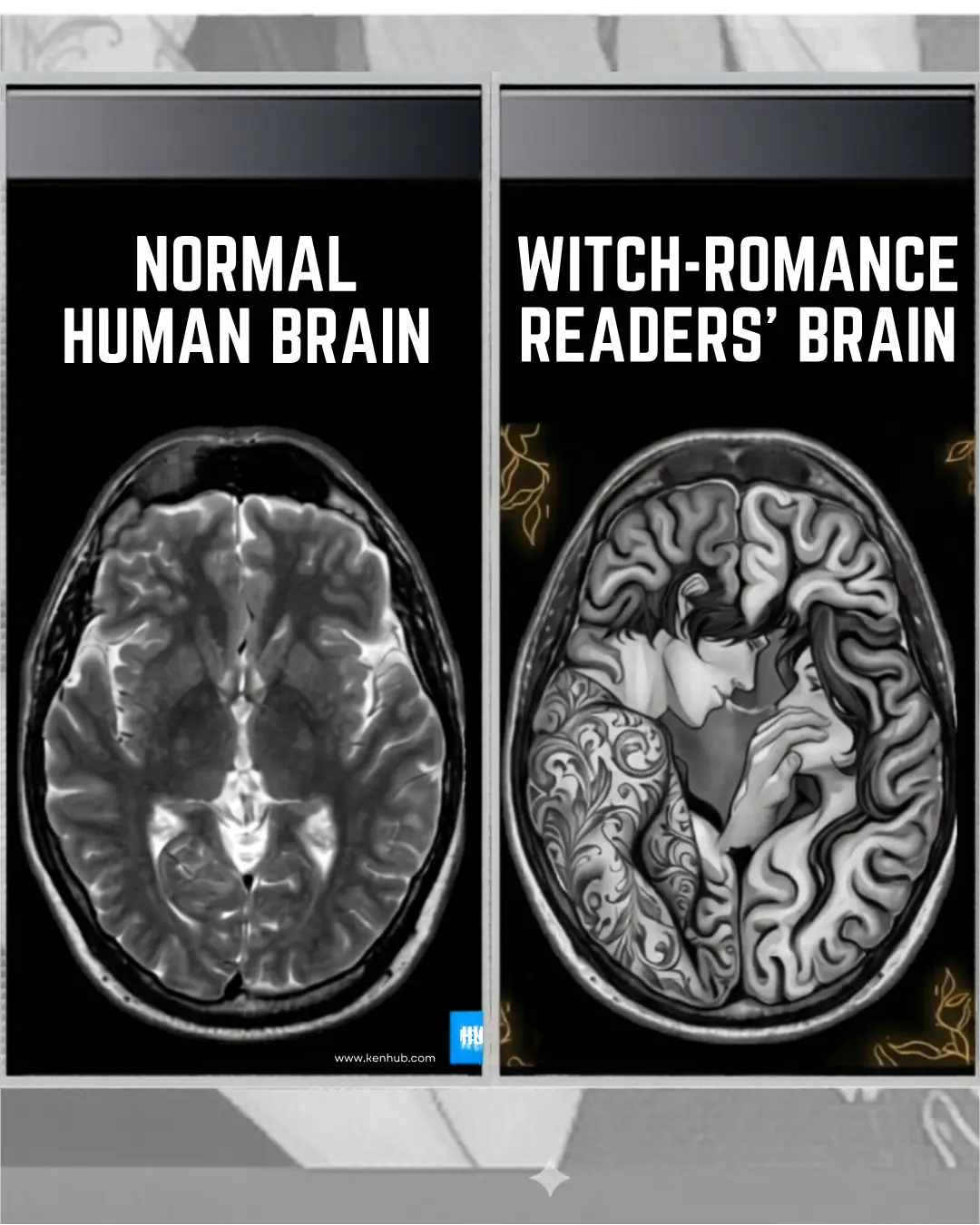
Concept 2: The Neural Mapping Meme
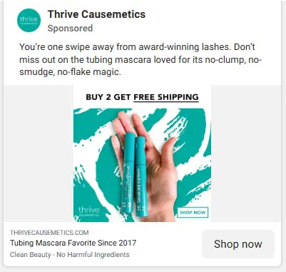
The second concept came from a beauty ad style where they show a competitor versus their own product.
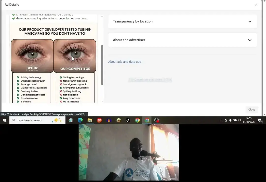 The icons and the simple black and white listicle structure pull the attention, so I decided to take this style and turn it into a meme instead of a listicle. My idea was to replace the face above with a picture of brain imaging to create the comparison.
On one side would be the "Normal Human Brain." On the other side is the "Witch-Romance Readers’ Brain."
I wanted the second brain to contain a spicy image of a man and a woman in the style of MRI imagery, so I found an MRI image (I think) used AI to create the below shenanigans so it looks like the doctor is seeing that specific image on the scan. It is a bit weird, but it works as a pattern interrupt.
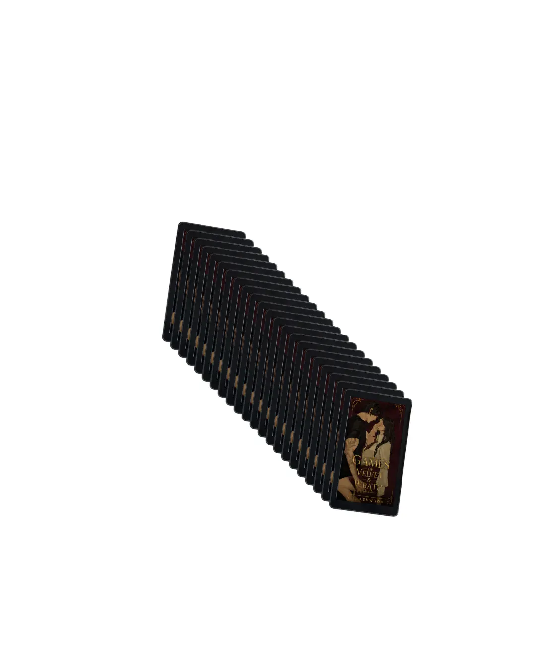
Concept 3: The Hand-Held Social Proof
The third concept involves a hand holding a product against a stylized background, which is nothing special at first glance. But I like e-commerce advertisers' ability to get potential buyers picturing themselves owning the product. This is a subtle technique but it works.
 I also picked this because Facebook is a social platform and seeing a product on a hand made it feel personal. When I look at it, it feels different than if the product were just sitting on a graphic background. I created a rough concept in Canva to see how it would look with a book. (The green graphic background can be swapped out for fiction appropriate styles, of course. )
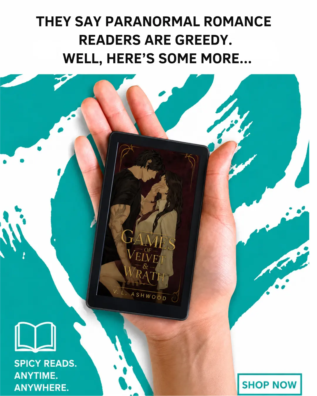 I used a hook from the spreadsheet stating that Paranormal Romance readers are greedy, and I am giving them more. I put the text in the middle because the upper parts of ads often get cut off. I used a mockup of a phone to show the story in the palm of your hand.
The Execution Stack: Canva and AI
My process for building these ads involves creating a rough concept in Canva and then using AI to clean it up. Canva has a feature that breaks an image into different layers, which helps when you want to rearrange things. Sometimes the graphics I make are amateurish, so I put them through a tool like Nano Banana to clean them up.
You can use the Magic Layers tool to separate the background and then replace a mascara bottle with a book cover. Don't worry if the rough versions you're creating on Canva look rough, just use them as scaffolding for your concepts and then let AI do a second wash (if you're not against it).
Anyway, this type of cross training works because it leverages pattern recognition. If a reader sees a book ad that looks like the beauty ads they already respond to, it is a language they are used to speaking. It makes it easier to connect with them. You start with a book you like, look at the reviews, see what else those people are reviewing, and steal the image ideas from those industries.